5 Details That Make or Break Your Custom Merch
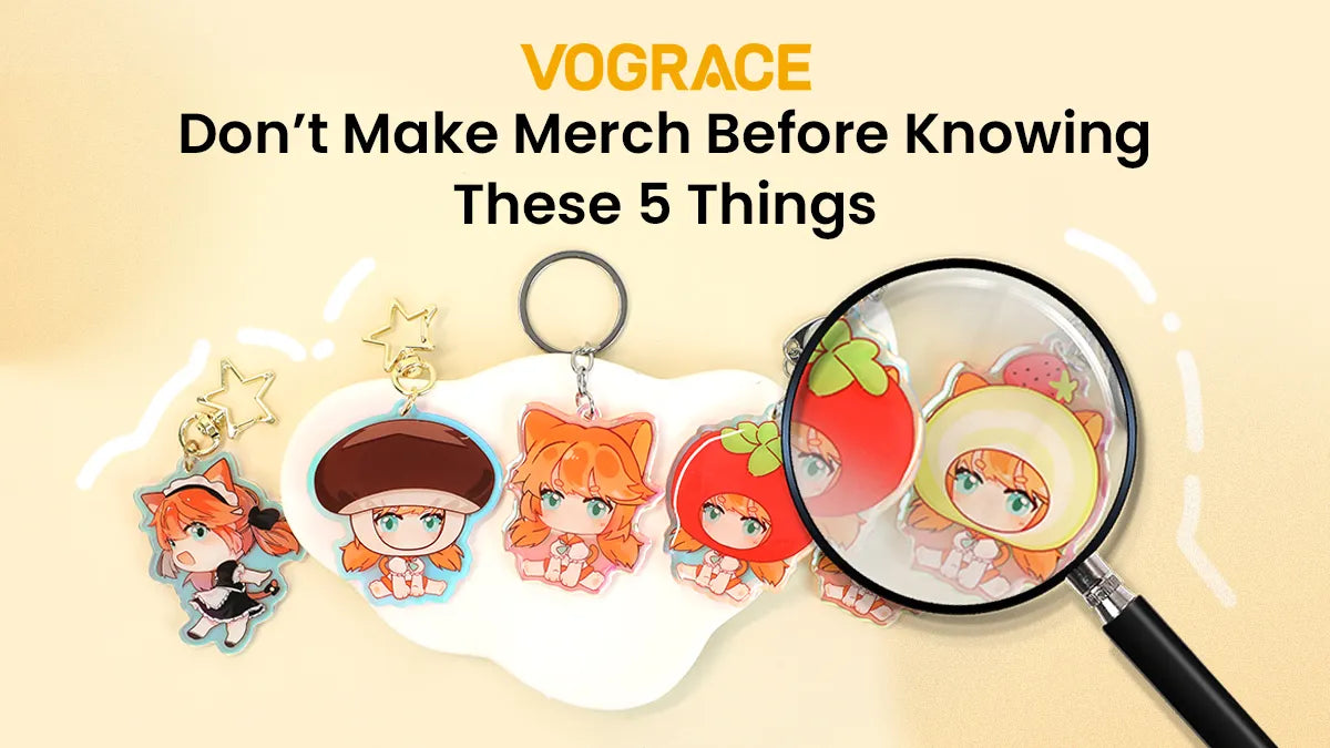
Turning your artwork into real merch is a milestone almost every creator in the ACG space goes through eventually. The moment a piece of fan art becomes an acrylic charm, a standee, a sticker, a badge, or a holographic card, it stops being something that only lives on a screen — it becomes something your fans can actually hold.
But when people customize merch for the first time, they tend to fixate on one question: "Can this even be made?" The better question is actually: "Before I order, have I thought through the details that matter?"
Size, file setup, product choice, color — these can feel like minor production details, but they're the difference between a product that matches what you pictured and one that quietly disappoints. If this is your first order, here are five details worth double-checking before you hit "buy."
Can Your Design Still Read at the Actual Size?
A lot of creators do their best work on a huge canvas, then forget the finished product might be just a few centimeters wide.
Where this usually goes wrong:
· Lines thinner than 0.25pt disappear or break apart once scaled down
· Text that's too small to read once it's printed
· Intricate patterns that blur into a smudge at a smaller size
· Too much crammed onto a small product, so nothing stands out
Fix it before you order:
· Scale your canvas down to the actual finished size and check whether lines and text still read clearly
· Keep line weight at 0.5pt or heavier — go a little bolder for smaller items
· Trim text down to the essentials, and keep any small type at 6pt or larger
· Simplify busy patterns and keep only the elements that make the design recognizable
· Drop your design into the product template preview to see it at real size before committing
Every Vograce product page lists the actual size range and includes a scaled preview, so you can look before you order — it beats trying to imagine it.
Is Your File Actually Print-Ready?
This is where most first-timers run into trouble.
A lot of artists design in RGB, which looks vibrant on screen but prints flat and dull. Or the resolution's too low, so edges come out blurry. Or there's no bleed, so part of the image gets trimmed away.
Common mistakes:
· Exporting in RGB instead of CMYK
· Resolution under 300dpi
· No bleed (usually 3mm) built into the file
· Text that isn't outlined or has fonts that aren't embedded, so it doesn't print as designed
· Transparent areas that turn into solid white instead of staying transparent
What to do instead:
· Export in CMYK at 300dpi or higher
· Add a 3mm bleed on every edge, and keep anything important away from the edges
· Convert text to outlines, or embed the fonts
· Use the alpha channel for transparency — don't fake it with white
If you're not sure your file checks these boxes, Vograce's team can walk you through the standard templates and file requirements for each product type. Downloading and checking against them before you order clears up most of the common mistakes.
Did You Pick the Right Product for Your Design?
Not every design translates well to every kind of merch.
A detail-heavy, color-saturated illustration can turn into a blur on a small badge. A minimal line-art logo can look empty on a large poster. Pick the wrong category, and even a great design won't get to shine.
A quick way to think about it:
· Simple lines, bold colors, a compact focal point → small formats like badges, stickers, and charms
· Detailed, scene-heavy illustrations with a full composition → larger formats like standees, posters, or shikishi
· Light, airy designs with negative space → transparent acrylic
· Dense, dark fills → be careful with transparent acrylic, since the color can show through and muddy the look
Still not sure? Vograce supports small-batch orders across categories, so you can print the same design as both a badge and an acrylic charm, compare them side by side, and then decide what to scale up.
Will Your Colors Hold Up Across Different Materials?
Most creators worry about whether their on-screen colors will print accurately. Fewer realize that even a perfectly accurate print can still look different depending on the material it's printed on.
The same red can look muted and matte on a paper sticker, bright and glassy on acrylic, and darker and deeper on a metal badge. If you're only judging color by how it looks on your screen, the finished product can end up further from your expectations than you'd think.
Where colors tend to go sideways:
· Low-saturation, pale colors on metal can come across gray and washed out
· Large dark fills on transparent acrylic can look muddy once light passes through
· Complex gradients on laser or glitter finishes can turn visually chaotic
· The same file used across different products can print inconsistently, so a "set" doesn't actually feel cohesive
What helps:
· Adjust your color choices for each material instead of reusing one set of values everywhere
· Push brightness and contrast up a little for metal or dark materials
· Stick to clear, bright colors on transparent acrylic, and avoid large dark areas
· If you're using a special finish — laser, glitter, pearl — look into how it affects color before you finalize anything
Vograce has real product photos and color references for each material, so you can see how a color actually performs on your target product before you commit.
Does Your Design Actually Fit the Product's Shape?
It's easy to focus entirely on whether the artwork looks good and forget that the finished product has a physical shape.
Badges are round. Stickers often need a custom die-cut. Acrylic charms have hanging holes and clear sections. If your composition doesn't account for the shape, the result can be awkward — a character's head cropped in half, a key detail sitting right where the hanging hole is, or an odd white patch where the design should be transparent.
Where this trips people up:
· Important details tucked into the corners of a round badge, then cut off
· Stickers with no white border or cut line, so the edge slices into the artwork
· Acrylic charms where the hanging hole placement wasn't considered, cutting through the design
· Large opaque white areas placed on transparent acrylic, killing the transparent effect
How to avoid it:
· Get the shape template before you order and build your composition inside it
· For round products, keep important content toward the center — think of it as a circular safe zone
· For stickers, plan your cut line early and leave a 2–3mm white border or bleed
· For acrylic, confirm the hanging hole position ahead of time and design around it
· For transparent products, skip large opaque white areas — use semi-transparent or partial fills instead
Every Vograce product page includes the shape guide and template file for that item. Laying your design out on the template first shows you exactly how the shape will affect it, so you're not stuck with a gap between "the art looks great" and "the product looks off."
The Takeaway
These five details all sound basic. But almost every creator who's customized merch has tripped over at least one of them at some point.
Customizing merch isn't just a purchase — it's a small step forward in your creative work. Getting the details right doesn't just get you closer to what you pictured; it also shows your fans how much care went into it.
If you're about to place your first order, save this list for later. And come check out Vograce — from product templates and shape guides to material color references and real-size previews, we're set up to help you get every detail right.
What's something you learned the hard way on your first merch order? Tell us in the comments — it might save someone else the same mistake.